


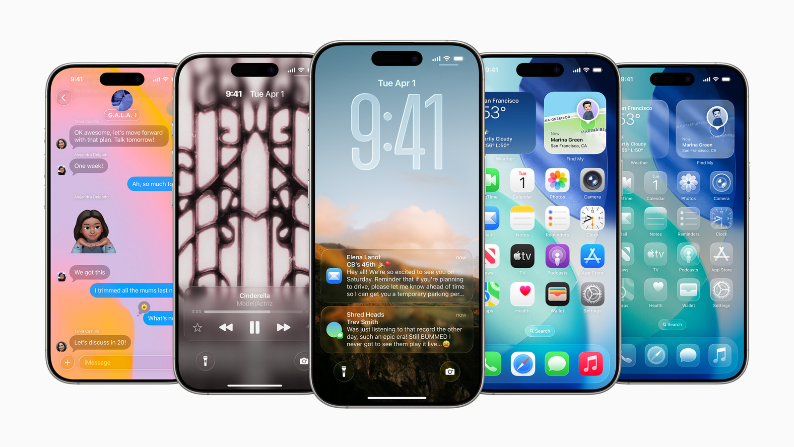
With the second beta of iOS 26 for developers, Apple has fixed a major criticism that people had with the Liquid Glass: the readability of the Control Centre. Apple has now made the control centre more blurry compared to beta 1, which many said was hard to see, considering most of the background reflected through.
")
Here are the details
With the second beta, the icons in the control centre did not stand out, in particular, because most of the background filtered through, making things hard to spot and, of course, hard to read. But now, with beta 2, Apple seems to have increased the intensity of the blur, which makes the foreground icons that still have glassy elements stand out a lot. While this still does not seem as strong as the current control centre implementation, from the looks of it, it makes the viewing experience a lot easier.
Having said that, it has sparked an interesting conversation on the Apple subreddit, wherein people are saying that they dislike the new version and that beta 1 was not bad, just that it needed time for users to adapt. Some users pointed out that the glass should be a little smoky and that the beta 2 version “does not look like glass anymore.”
MOBILE FINDER: iPhone 16 LATEST Price And More
Notifications have also received attention, too
As pointed out by popular YouTuber Aaron Zollo of Zolo Tech, the notifications you get with beta 2 are slightly improved as well. They are more readable compared to what you got with beta 1; there is apparently more contrast. So, while the notifications are slightly better if you apply a light-coloured background, many people say that it could still affect readability.
It is still going to be a while before Apple finally launches the final version of iOS 26 and other operating systems where Liquid Glass is going to be a present, including macOS 26 and iPadOS 26, likely in September. And that is why Apple could bring in many changes before the final release.


